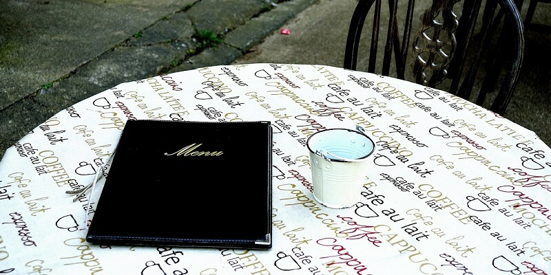
Whether you are just opening your restaurant or revamping your entire concept, the menu creation can be extremely exciting. It’s one of the main reasons why customers will come to your restaurant. The items you put on your menu will be a big determinant on how profitable you will be. The items you put on your menu and they layout will basically contributing factor to the success of your restaurant. Here are some tips on designing a successful that you and your customers will love.
1. Stay Organized
Every good menu has a flow. A good menu starts with the appetizers, then your soups and salads, your entrees and sides, and finally your deserts. If you have specials, you may want to consider having a second menu for those, especially if they change. Every placement of each section can impact each individual sale. If you attempt to combine something like entrees and sides, it could confuse the guest and make them hesitant on ordering it.
2. Menu Boards + Paper Copies
If you are going for the concept of displaying your full menu on a board, you need to consider adding paper menus that easily accessible to customers. You need to be prepared for customers having a hard time reading your menu if it’s placed like a billboard. Having paper copies can also alleviate any questions that could hold up an ordering line between a customer and staff member.
3. Use Descriptive Text & A Good Color Palettes
It’s important to choose text and colors that align with your restaurant’s logo. You don’t want it to matchy, but you also don’t want red and pink only menu. If you look at human psychology, it’s said that different colors are supposed to initiate different moods in people. Using specific colors like red can also help in drawing attention to specific menu items over others. It’s never a good idea to use a menu font that hard to read. Meaning it’s a good idea away to stay away from anything that’s too cursive. For font size you don’t want to go too small, and you don’t want to go too big either. Customers shouldn’t have to flip to page 10 to get to the entrees. Additionally, for each menu you item you should be proportionally descriptive. If you don’t give enough detail under each menu item, your staff could get a lot of questions during the ordering process. This could then hold up table turnover, and you could lose potential sales.
4. Be Mindful of The Images You Use
Too many images could distract people from menu items, and blurry photos could make your menu look cheap. Most restaurants either go bold with big, beautiful images or they have nothing at all. If you decide to go bold, you should consider hiring a professional photographer. Even the lighting of a food item’s picture can determine if it will sell. It’s better to use original images than stock photos because you could come across customers who will say their meal didn’t look like the photo. If you don’t want to use photos of your food, but you still want something to spice up the menu besides cool colors, you can use photos of your restaurant and your area. Everyone likes seeing pictures of events you have put on at your establishment or charities you sponsor as well. The types of photos you can use on your menu are endless, but the main goal should always be that they are crisp and paint your restaurant in the best light.
5. Use a Proper Pricing Design
Pricing should be the last thing you do when you’re designing your menu. You should first consider your inventory and food costs. Using a POS system can automate your food and inventory costs in relation to your menu. From there, you can start designing your prices. When you have finished designing your prices, you should take a step and analyze them. You don’t want desserts costing more than your entrees, and you want to make sure your beverage prices are proportional to your menu items. You wouldn’t want to offer a $500 bottle of wine, and your most expensive entree item is $13.
6. Have More Than One Type of Menu Design
People who are using your online ordering system, or come into your restaurant for a full sit down meal all have different intents when it comes to your restaurant. Online ordering could mean they are in a hurry, and they want the easiest selection for what they want at your restaurant. While a sit down meal could mean they have time and want to come in and experience your restaurant. The best online menu would mean having a quick load time, and being compatible with mobile devices. While a sit down menu could mean having a bill board menu and durable menus for table serving.
7. Look At Your Menu Like Your Customer
When think you have finished your menu design, you should review your menu as if you were the customer. Make sure there is nothing misspelled or there are no grammatical errors. This can look sloppy to customers. It might also be a good idea to have more than one person look at your menu, because you don’t want to find a mistake after your menu items have been printed.